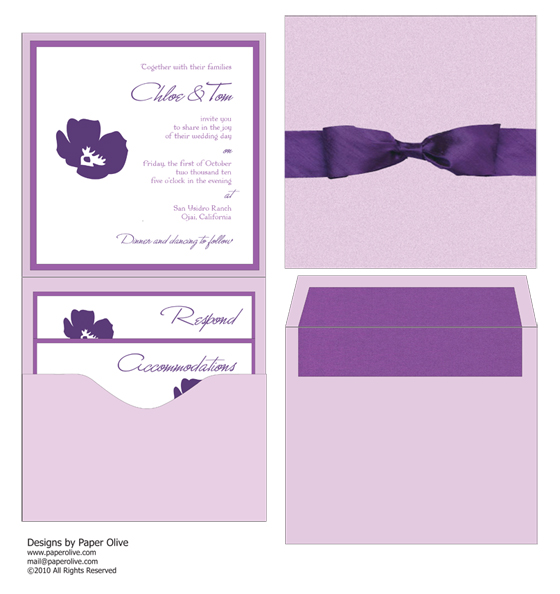
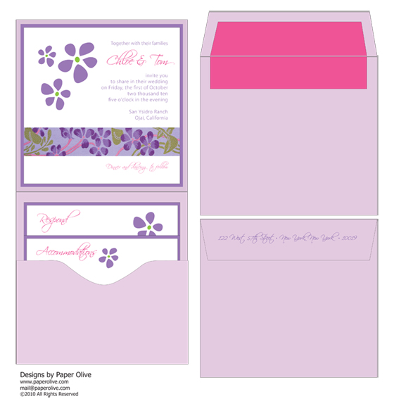
so, i've found myself with a little invitation crush — on two designs i recently put together for a celebrity couple who was in love with the purple palette.
and why wouldn't they be? purple can be arresting, chic, even regal. i've actually noticed a trend towards purples & plums this season, and had a blast exploring several possibilities with this couple. which is your favorite?
modern & minimalist
 this one was for the bride, who wanted clean lines and a simple design. i love the use of multiple hues within the same color family. from deep to muted, the color is elegantly subtle here. hand-stamping gives the floral design an extra tactile effect that mirrors the texture of the silk dupioni ribbon. it's sophisticated and classic, but also contemporary and fresh. a true fave.
playful & pink

this one, designed for the groom, plays with similar hues but has an entirely different tone and mood. it's bright, whimsical, a bit more casual but still entirely chic. clearly, tactile elements are huge with me, as with the french floral ribbon that brings green and pink into this palette. accents of pink ink and a textured liner give these purple hues a softer vibe. it just makes me happy.
i think i'll have to rethink my favorite color...


No comments:
Post a Comment